Graphics

|
Personal LogoA logo that I created to represent myself with. There were several ideas that were made and tested, but this logo was the best out of the bunch. I combined the I and T in my first and middle names respectively to create the logo design, with the I acting as the top bar on the T. I slanted the design to make sure that you can see both the I and the T at the same time. I honestly really liked it because it was cool looking, although it also represents me well in my opinion.
| ||
Flat Design ProjectThis is a flat design graphic created in illustrator that contains 5 objects that I felt would describe me fairly well, which is mainly why I have it here. The Playstation controller and the desktop show that I like video games on two different platforms, while the earbuds showed that I am a big fan of music. Sushi is included because it's delicious.
|

|
"It's All About the W" Project

At Wakefield High School, the motto is "It's all about the W!" I created a graphic of that motto with a math and teaching focus using Photoshop. The idea of using math came from a math textbook I had obtained earlier in the day starting the project. The large "W" in the middle was traced from an image that our teacher had provided, though all other writings on the board were drawn using a mouse for realism.
Logo Design
|
The logo design project consisted of creating several logos for a fake business, and choosing one of them to create into a logo package. The type of business I had to create a logo for was based around computer repair, which is why I named it "Tech Rehab." The image of the logo is in a logo package format, consisting of different versions of the logo, as well as its font. A pattern using the gears and connectors was made, found at the bottom.
|

| ||
|
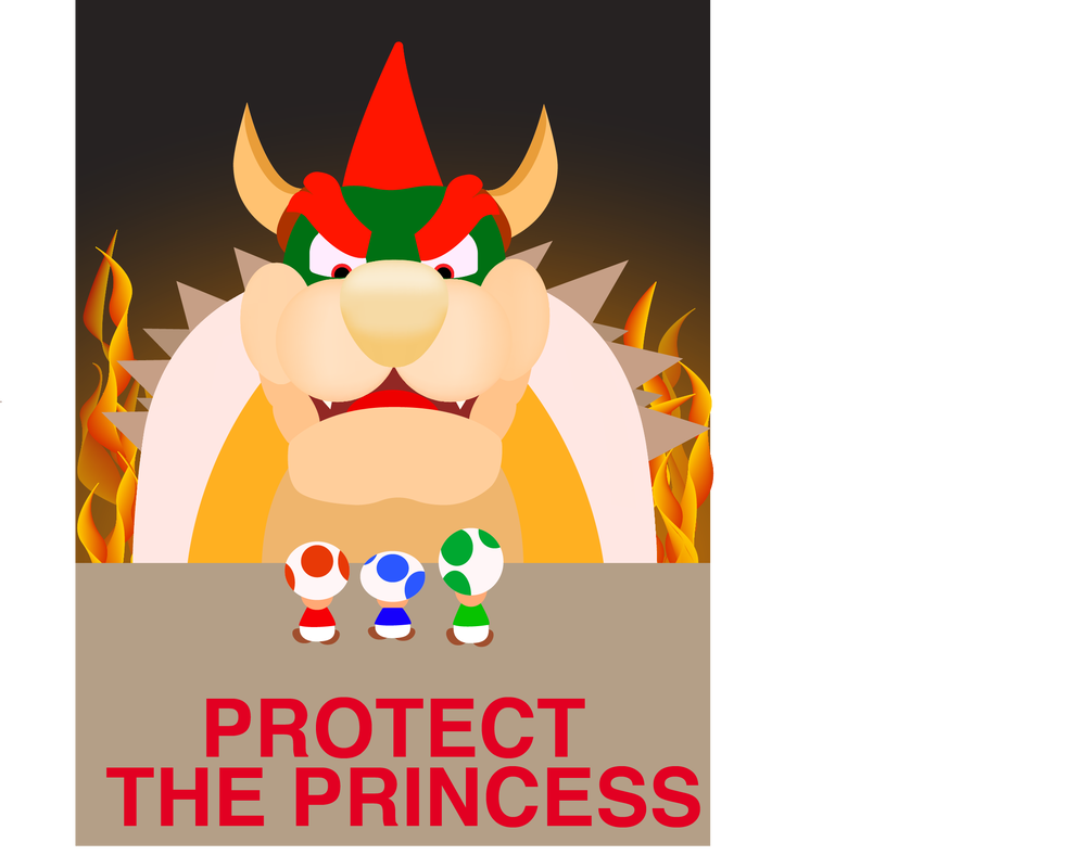
Propaganda PosterA propaganda poster about the toads banding together against bowser's tyranny. It was an idea that came primarily from games that I've been playing recently and was something I wanted to try out. Bowser's head was the primary emphasis in this poster since I wanted it to be the highlight. I wanted it to dominate over the 3 menial toads to show how imposing bowser can be.
|
Typography Project"Every child is born an artist. The problem is how to remain an artist when you grow up" is a quote by Picasso. I created this typography poster in photoshop using several fonts, effects, and some masking. Fonts were more focused on in this project compared to other projects that I have done and I learned a lot about them. I chose the quote by Picasso due to its relevance to art and the potential the words held for making an interesting poster.
|

|
Final Fantasy Playing Cards
This is what I personally considered my first "large" project. It was a month long project for my class and was one of my favorite projects in 2020. We were given a high amount of freedom when it came to the concept, so I chose to do a final fantasy based deck of cards. We had to create the whole 52 cards with differing face cards (King, Queen, Jack, and Ace) for each suit.
One of the biggest challenges with this project was time management. Even with weekly check-ins and feedback, keeping track with and creating cards was difficult to do over a month. The hardest cards were easily the clubs, as I had to create the heads of four of Final Fantasy VII's characters. I used the remake that came out earlier in 2020 as a basis to help me create each card. They intentionally don't have facial features to fit in a little better with all the other cards.
If there's anything I would change here, it would probably be the number cards and symbols. I feel they could be more iconic and could be changed for the better with more time.
Magic The Gathering Meme Cards
For a class final project, I chose to create 20 meme based cards based off the popular trading card game Magic the Gathering. This was chosen for a final project to see if my photoshop skills had improved. Overall, I think it may have improved, at least slightly.
The main challenge here was timing myself to create all 20 cards, as well as finding a proper template. Although there were pre-made empty templates, I chose not to use them at all for the sake of challenging myself. It'd be more fun that way for me too. Adjusting the images to make sure they didn't stick out too much was also challenging. Sometimes the backgrounds were too bright or too dark, other times the image was difficult to crop for the card. Using my photoshop knowledge that I've gained from projects this semester however, I managed to figure out solutions to most of them.
The hardest card for me in this set was the Boromir card. Balancing the colors and making the background and Boromir himself contrast properly was difficult. I'm not entirely sure if I did it correctly still, there are things I would rather change, but I think it looks well for the time constraint that I had. I would also choose to change the Math Lady card a little. The cropping needs work and it just looks too busy to me.
Animation/Video
Stop Motion Film
|
This is a stop motion film that I did with a friend. It is about a cube that has separated from its larger counterpart. The reason why this is in the animation portion of the website is because Adobe Animate decided to constantly crash whenever we used it, so instead we tried to capture the idea of an animation with a stop motion film.
|
|
